
Introduction
Federal evaluators often review hundreds of pages of technical proposals, making clarity and readability critical factors in the evaluation process. A well-structured proposal must communicate complex solutions, demonstrate value, and help evaluators quickly understand an organization’s capabilities.
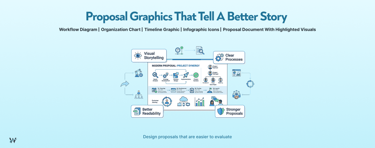
Proposal graphics play an important role in achieving this goal. Strategic visuals help simplify complex information, highlight key differentiators, and improve evaluator engagement. Rather than serving as decorative elements, professional proposal graphics are communication tools that strengthen proposal storytelling and make critical information easier to absorb.
A strong proposal combines compelling written content with effective visuals to create a clear, organized, and persuasive response.
Why Proposal Graphics Matter
Government proposals often include complex technical approaches, implementation strategies, workflows, organizational structures, and performance information. Explaining these elements only through text can make proposals difficult to follow and increase the time required for evaluators to understand the solution.
Well-designed proposal graphics help transform complex ideas into easy-to-understand visual formats. They allow evaluators to quickly identify important information and connect different components of the proposed solution.
Effective proposal graphics can:
Simplify Technical Concepts
Technical solutions often involve multiple systems, processes, and dependencies. Architecture diagrams, workflow charts, and visual models can explain these concepts more effectively than lengthy paragraphs.
For example, a cloud migration strategy can be easier to understand through a visual representation showing current systems, migration phases, security controls, and future-state architecture.
Highlight Processes and Workflows
Process graphics provide a clear view of how services will be delivered. They help evaluators understand project methodologies, operational approaches, and quality management processes.
A visual workflow can demonstrate:
Emphasize Differentiators
A proposal must clearly communicate why an organization is the best choice. Graphics can highlight unique capabilities, innovative approaches, past performance results, and measurable benefits.
A comparison chart, capability overview, or benefits infographic can help evaluators quickly identify competitive advantages.
Improve Document Navigation
Long proposals can become challenging to review. Strategic graphics improve document flow by breaking up dense content and guiding evaluators through important sections.
Visual elements such as icons, diagrams, and summary charts make proposals more organized and easier to navigate.
Increase Evaluator Engagement
Evaluators spend significant time analyzing proposal responses. Effective visuals create a better reading experience by presenting information in a format that is easier to process and remember.
A balanced combination of written content and graphics improves comprehension and keeps evaluators focused on key messages.
Types of Proposal Graphics
Different proposal sections require different types of visuals. Selecting the right graphic format ensures information is presented clearly and effectively.
Process Flow Diagrams
Process flow diagrams illustrate workflows, methodologies, and service delivery models. They are useful for explaining step-by-step approaches and showing how different activities connect.
Common uses include:
A well-designed process flow allows evaluators to understand the proposed approach without reading multiple pages of explanation.
Organization Charts
Organization charts provide a visual representation of leadership structures, team responsibilities, and reporting relationships.
They help demonstrate:
For government proposals, organization charts can reinforce confidence that the proposed team has the right structure and expertise to successfully execute the project.
Timelines and Implementation Roadmaps
Timelines help present project schedules, milestones, and delivery phases in an easy-to-follow format.
A visual implementation roadmap can show:
This allows evaluators to quickly assess whether the proposed approach is realistic and achievable.
Infographics
Infographics summarize important information using visual elements such as icons, statistics, and short descriptions.
They are useful for presenting:
Instead of overwhelming evaluators with large blocks of text, infographics present information in a concise and memorable format.
Solution Architecture Diagrams
Solution architecture diagrams are especially valuable for technology-focused proposals. They visually explain how systems, applications, platforms, and integrations work together.
These graphics can demonstrate:
Clear architecture diagrams help evaluators understand the technical approach and validate the feasibility of the proposed solution.
Best Practices for Proposal Graphics
Creating effective proposal graphics requires more than adding images or diagrams. Each visual should support the proposal’s overall message and improve evaluator understanding.
Keep Designs Simple and Uncluttered
A proposal graphic should communicate information quickly. Overly complex visuals can create confusion instead of improving understanding.
Effective graphics should:
The goal is to make information easier to understand, not create additional complexity.
Maintain Consistent Branding
Professional proposals should maintain a consistent visual identity throughout the document. Consistent formatting improves readability and creates a polished presentation.
Graphics should align with:
Consistency helps create a professional impression and improves proposal credibility.
Label Graphics Clearly
Every graphic should include meaningful labels, titles, and descriptions. Evaluators should immediately understand what the visual represents and why it matters.
Avoid using unclear diagrams that require additional explanation. A strong proposal graphic should communicate value even when viewed independently.
Support the Written Narrative
Graphics should complement written content, not replace it. The surrounding text should explain the importance of the visual and connect it to the proposed solution.
For example, a cybersecurity framework diagram should be supported by a description explaining how the approach protects systems, manages risks, and supports compliance requirements.
Ensure Graphics Answer Evaluator Questions
The best proposal graphics address common evaluator concerns, such as:
Every visual should have a purpose and contribute to the evaluation criteria.
Common Proposal Graphic Mistakes
While effective graphics strengthen proposals, poorly designed visuals can reduce clarity and professionalism.
Overloading Graphics with Text
A common mistake is placing too much information inside a graphic. Large blocks of text make visuals difficult to read and reduce their effectiveness.
Graphics should summarize information, while detailed explanations should remain in the proposal narrative.
Using Inconsistent Designs
Different graphic styles, fonts, and formatting choices can make a proposal appear unorganized.
Maintaining consistent design standards improves professionalism and creates a better evaluator experience.
Including Visuals Without Context
A graphic without explanation may confuse evaluators. Every visual should connect directly to the proposal content and explain how it supports the solution.
Using Poor-Quality Images
Low-resolution images, unclear diagrams, or outdated visuals can negatively impact the proposal’s presentation quality.
Professional graphics should be clear, readable, and optimized for proposal documents.
How Professional Proposal Graphics Strengthen Winning Proposals
Proposal graphics provide a competitive advantage by improving communication and helping evaluators quickly understand complex information.
Organizations that invest in professional visuals can create proposals that are:
Whether explaining a technical solution, presenting a project plan, or highlighting organizational capabilities, the right graphics can transform a standard proposal into a compelling and persuasive response.
Conclusion
Proposal graphics are strategic communication tools that improve evaluator engagement and strengthen proposal effectiveness. When designed correctly, visuals simplify complex concepts, improve readability, and reinforce important messages throughout the proposal.
Successful proposals do not use graphics simply to fill space. They use visuals intentionally to guide evaluators, demonstrate capabilities, and communicate solutions clearly.
By combining strong written content with professional proposal graphics, organizations can create more impactful submissions that improve understanding and increase their chances of success.
Call to Action
Need help creating clear, evaluator-focused proposal graphics that strengthen your government and business proposals?
Partner with our proposal experts to develop professional visuals, improve proposal presentation, and create responses designed to stand out. Contact us today to enhance your proposal strategy.